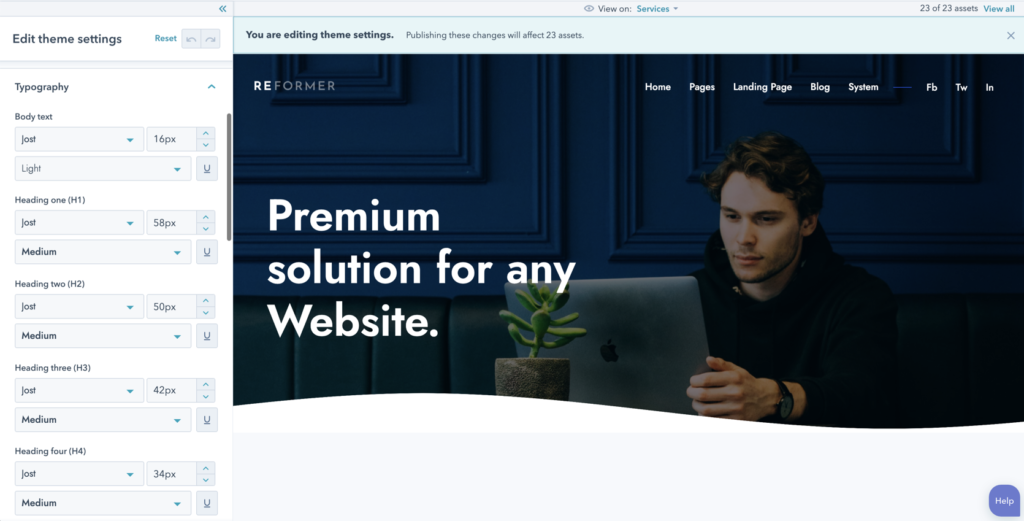
In your Typography settings, you can control the fonts applies to certain elements in your templates. All Google fonts are supported. You can also select the custom color for the links in your website.
You can customize the exact font, size, and style for the headings included on Reformer, the body font, the menu font, the leader text, the large text and the link text.
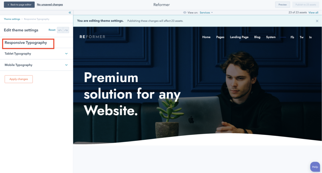
In your Responsive typography settings, you can fully customize the font-size for devices whether it is a small laptop (max-width 1440 pixels), a tablet (in both landscape & portrait) or a mobile device.


